
The best user experience (UX) on a product can be achieved only if usability is also positioned as a must-have requirement throughout the analysis and design process, in addition to functionality and visually aesthetic concerns.
Usability is the criterion that determines how easy a product is for its users. Even if it is very elegant and has great functionality, a product cannot fully meet the needs of its users unless it is usable. So unused features of the products create a huge amount of waste.
Gaudi Approach
Throughout the history of architecture design, Gaudi has been the most famous architect with his user-centered architecture design approach. During his childhood, Gaudi suffered from poor health. This situation prevented him from going to school, and he spent most of his time in nature. His observations of nature inspired his design approach, which can be summarized as follows: “The great book always open, and which we should make an effort to read, is that of Nature.” Using this philosophy he designed buildings with “organic style,” which then became an important standard in architecture.
Humanization of Products
Another man revolutionized the high-tech industry in a similar way. By positioning users at the center of the analysis and design process, Steve Jobs led the innovation of the most usable consumer electronics products ever.
He achieved creating natural-born users of his products. Even kids can use his company’s mobile devices with gestures similar to their natural behavior. This new design approach made his company the best performer in the high-tech industry.
After the success of this approach, it was realized that the humanization of products is not necessarily achieved by anthropomorphic features but mainly by ensuring usability.
Building User Interfaces around Users
A lean UX design approach that is both user centered and iterative should be applied to ensure usability of a new product.
A. Identify User Profiles
“Designing for everybody” is not a feasible and effective strategy in terms of usability. Interfaces of a product are usable if they are a good fit for its users. Thus a product’s user interface design should be based on the profile of its target user groups. Profiling can be done based on diverse user characteristics, such as:
-age,
-gender,
-education,
-computer use comfort level,
-smart phone comfort level, and
-business background.
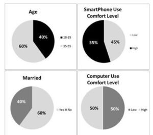
For the CEC mobile application project, the profiling of customers was as follows:
An effective way to understand user profiles during requirements-gathering sessions is to ask users their opinions about the existing products. Users’ comments can be interpreted to understand their own capabilities and weaknesses. This reminds us of a quotation by the famous philosopher Spinoza: “If Pierre tells something about Paul, we learn more about Pierre than we learn about Paul.”
In addition to interviews and focus group meetings with users, UX designers should also conduct field-analysis techniques—such as shadowing and user task analysis—to observe users in their own context and then profile them accordingly.
- Define Personas and Their Mental Models
Another important aspect of user centricity is emotional design. Human beings judge products based on their left brains’ logical and right brains’ emotional capabilities. And most of the time, emotion is the main criterion in their judgments to buy a product.
In alignment with their emotions, users first create a mental model of the products they use. This model guides them throughout their whole experience with the product. Therefore, user interface designs should be based on the mental model of users rather than of designers.
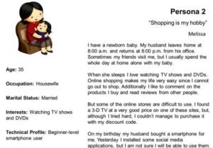
Personas, which are representative imaginary characters, are the best way to define the mental models of diverse user profiles and predict their expected interaction with the product and behavior on user interfaces. Although there can be several user profiles for a product, UX designers should limit the number of personas to three (or at most four in extreme cases) to prevent falling into the trap of “designing for everybody.” A persona description should include a name, a photo, demographic information, and a scenario section.
For the CEC mobile application project, the UX team defined the following two personas after analyzing user profiles and working with the marketing business unit.

C. Interaction Design
In the lean UX design approach, meeting user needs with a minimum number of steps on the product’s user interfaces is highly appreciated. This can be achieved by a good interaction design.
“Architecture Begins Where Engineering Ends” —Walter Gropius
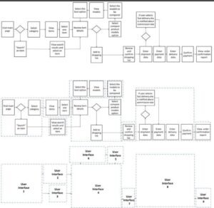
If well defined, flow charts visualizing use case scenarios form a perfect basis for design interaction of users with the product.
During interaction design, boxes on the branches of the flow chart are grouped within containers. These containers (dashed boxes) become a primary user- interface window, a dialogue box, or a message box. Or several containers combine and form a single user interface. Links between flow chart containers become navigation elements, such as links. This method, which is mainly based on the grouping of requirements, mitigates the risk of missing any functionality
on user interfaces of the product. It also prevents mismatch between the flow of use case scenarios and the flow of user interfaces, and ensures usability.
For the CEC mobile application project, flow charts were used for interaction design as follows:
- Information Architecture
User interfaces of products are composed not only of functional requirements (tasks) but also of content requirements.
Therefore, in parallel to interaction design (based on functional requirements), the information architecture (based on content requirements) should also be designed. The main objective of information architecture design is to identify content requirements, define content categories, and finalize the navigation structures of a product’s user interfaces by using techniques such as card sorting and wireframes.
In the lean approach, the content on the user interfaces of a product should have two main attributes:
- Concise
-Have statements that are short and to the point
-Leave no room for misinterpretation
-Have content that is simple and expressed with a minimum number of words. This quotation from Mark Twain describes this situation very well: “I didn’t have time to write a short letter, so I wrote a long one instead.”
- Useful
-The content on user interfaces should remove the friction of product with its users. User interfaces should speak the language of users, not the technical teams.
-Rather than offering a one-size-fits-all approach, the content should address the information needs of target personas. Persona representatives should feel that the content on the product’s user interfaces is created especially for them.
-Content should have clear links and CTAs (call to actions) that help users navigate intuitively without too much thinking.
Card-Sorting
If content is not grouped correctly, users will have difficulty finding what they are looking for on the product’s user interfaces. This is a common type of usability defect.
Card-sorting is an effective information architecture technique to prevent this risk. It is used to categorize content.
In the card-sorting technique, content items are written on cards, and users who represent personas are asked to group these items.
By using a card-sorting study, the CEC mobile application’s product category structure was defined as follows:

E. User Interface Design
UX designers convert interaction designs and information architectures into user interfaces of products by applying UX design and usability principles.
Even the most experienced designers can’t produce the optimum design at the first trial. Good design is a result of several iterations. Iteration is a cycle of doing something, testing it, improving it, and retesting it.
Making iterations on the final product is a very costly approach. Because for every iteration, the technical components of the product have to be changed and retested, whereas changing the prototype is much easier and faster compared to changing the final product.
In the lean approach, the project team and customers should frequently come together and evaluate the functionality and usability of the product early on prototypes.
Recent prototyping tools allow mocking up the products and simulating them in an interactive way. They allow user actions, such as navigating between interfaces, selecting options, and getting notifications by error messages. Thanks to these interactive features, both functionality-and usability-related defects can be found and fixed at the early stages of the project without waiting for user acceptance tests on the final product.
By this iterative approach, a high number of CRs can be prevented. Also early detection of defects, without waiting for late user-acceptance tests, reduces the cost of fixing them and eliminates waste.
In the lean approach, prototypes are also considered work-in-process inventory. Thus, instead of mocking up every user interface and creating waste, UX designers should create the prototypes of user interfaces corresponding only to the most frequently used, high-priority features.
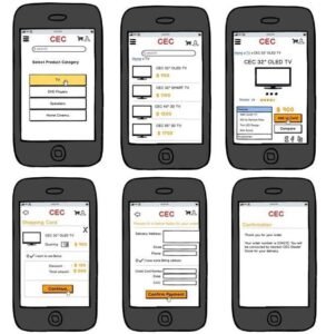
For the CEC mobile application project, the BA-Works team only mocked up user interfaces of the high-priority product features that were developed with the waterfall approach at the first phase of the project. To achieve simplicity, the mobile application’s user interfaces included everything users needed and nothing they didn’t.
Having interaction designs based on well-prepared use cases and flow charts made it easy for the project team to create prototypes of high-priority features that made up the core version of the product. The team detected and fixed functionality-and usability-related defects early on the prototype before releasing it in the market. This prevented a considerable amount of waste due to potential CRs.
Do We Need Prototypes in Agile Projects?
As mentioned earlier, agile methodology was applied at the second phase of the CEC mobile application project. To minimize WIP inventory, our team didn’t prototype user stories. Instead working parts of the mobile application corresponding to user stories were used for functional and usability testing.
For agile projects, if user stories have the right level of granularity and are atomic, working parts of the product can be developed quickly and used for
functional and usability testing instead of spending extra time for prototyping.
Picasso-Perfect Designs
During prototyping, UX designers and business analysts may hesitate when considering whether to behave like a craftsman or an artist. Until the Renaissance, the majority of architects designed their artifacts with a craftsman approach. Aesthetics were still important for architects, but their main concern was designing buildings, bridges, and fountains that best met the needs of the public. After the freedom and creativity impact of the Renaissance, architects started to behave more like artists and focused on designing more aesthetic pieces.
Instead of trying to create Picasso-perfect designs with an artistic approach, business analysts and UX designers should always behave like craftsmen during prototyping. They should focus on meeting the functional needs of customers in the most usable way, leaving aesthetic concerns to visual designers. In summary they should create prototypes that mainly show how the product’s user interfaces will interact with users without its visual bells and whistles.
Less is Much More in the Lean Approach
With the lean approach, user interfaces of products should be designed simple enough to leave no need for learning how to use the product. The best user interfaces are simplistic and intuitive ones, on which users can easily find what they are looking for and complete their tasks with minimum effort and error.
On the opposite side, busy and noisy interfaces make the experience complicated for users. This kind of design can be easily created by distributing the functional specs randomly on different parts of user interfaces without too much design thinking.
Legendary soccer player Johan Cruyff once said, “Football is simple. But nothing is more difficult than playing simple football.” Similarly, it is not that easy to create simplistic and intuitive user interface designs. Simplistic designs require extra time and effort.
The secret to achieving simplicity in design is best explained in the quotation from famous novelist Antoine de Saint Exupery: “A designer knows he has achieved perfection not when there is nothing left to add, but when there is nothing left to take away.”
However, in simplifying user interfaces, an Einstein quotation should also be remembered to prevent the risk of false simplicity: “Everything should be made as simple as possible, but not simpler.” The unnecessary parts of the user interface should be removed to make the interfaces simpler, unless removing these parts clears away any product functionality.
Customer Journey Mapping
For the CEC mobile application project, our team applied a customer experience evaluation technique called customer journey mapping in addition to traditional usability testing methods.
Customer journey mapping was an effective tool to visualize and evaluate the end-to-end experience of CEC customers at different touch points. From the customers’ own perspective, their experience, emotions, and satisfaction level at each part of the journey were visualized.
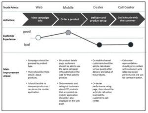
In addition to exploring improvement areas for interaction channels, this study also helped the team determine whether desired value was created for customers at each touch point.
For instance, at the second phase of the project, the following additional features were identified as an outcome of the customer journey mapping study:
-Customers should be able to rate and comment on dealer service quality after delivery and setup of the products.
-Comments and ratings of customers about CEC products that are posted via the mobile application should be also displayed on the web page.


